Defenders Campaign Guidelines

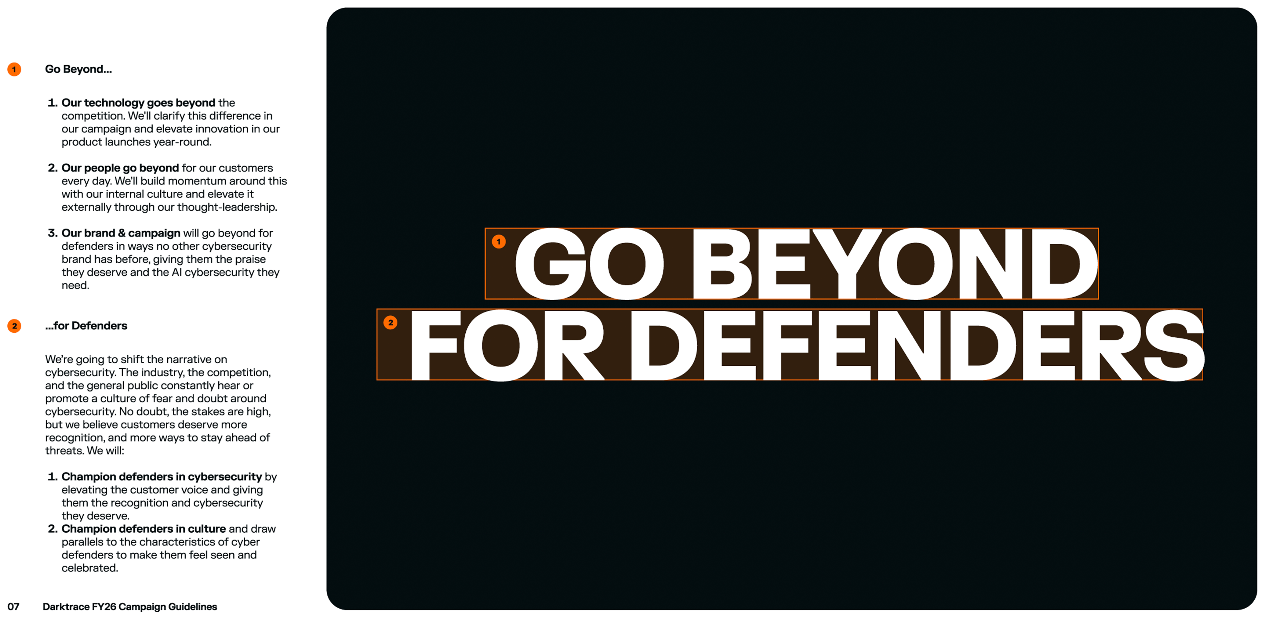
- Our technology goes beyond the competition. We’ll clarify this difference in our campaign and elevate innovation in our product launches year-round.
- Our people go beyond for our customers every day. We’ll build momentum around this with our internal culture and elevate it externally through our thought-leadership.
- Our brand & campaign will go beyond for defenders in ways no other cybersecurity brand has before, giving them the praise they deserve and the AI cybersecurity they need.
- Champion defenders in cybersecurity by elevating the customer voice and giving them the recognition and cybersecurity they deserve.
- Champion defenders in culture and draw parallels to the characteristics of cyber defenders to make them feel seen and celebrated.

Images Show Context
Making Messaging Work
More Than a Single Asset
We use Brand-level messaging to create awareness about Darktrace and its position to recognize and celebrate defenders with AI cybersecurity solutions that stop novel threats.
The world needs defenders. Defenders need Darktrace.
The AI cybersecurity defenders deserve.
Platform-level messaging delivers on the unique benefit of what Darktrace’s complete AI cybersecurity platform can do – stop novel threats.
Defenders deserve AI cybersecurity that stops novel threats.
Defend beyond with proactive AI cybersecurity.
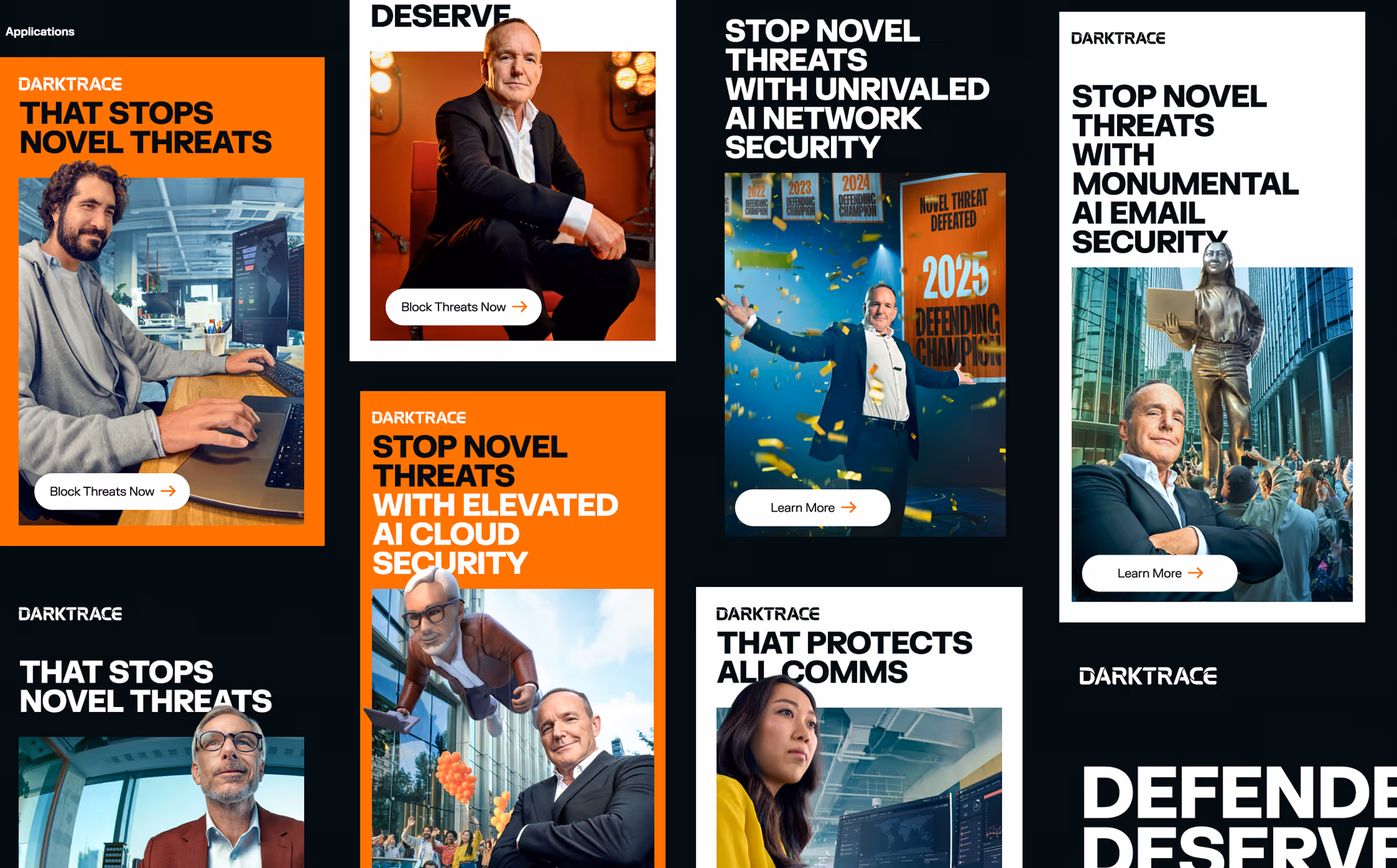
/ CLOUD product messaging will specifically call out the benefits of Darktrace’s AI cloud security and will use the “elevated” language when paired with the parade celebration visuals.
Defenders deserve AI cloud security with real-time novel threat detection
Defend Beyond with elevated AI cloud security
Stop novel threats with elevated AI cloud security
/ EMAIL product messaging will specifically call out the benefits of Darktrace’s AI cloud security and will use the “monumental” language when paired with the monument celebration visuals.
Defenders deserve AI email security that protects beyond the inbox
Defend Beyond with monumental AI email security
Stop novel threats with monumental AI email security
/ NETWORK product messaging will specifically call out the benefits of Darktrace’s AI network security and will use the “unrivaled” language when paired with the banner celebration visuals.
Defenders deserve AI network security that stops zero days before day zero
Defend beyond with unrivaled AI network security
Stop novel threats with unrivaled AI network security

Color Combinations
We encourage following the approved color combinations and order shown here, which maintain strong contrast, ensure legibility, and create a balanced, impactful visual presence.


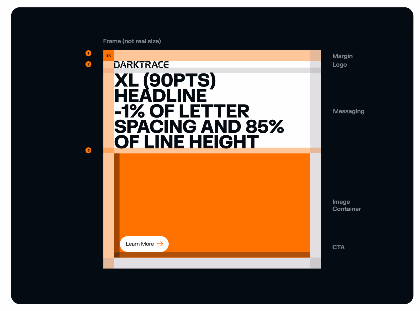
Grid & Layout
Apply these principles to help construct your ideas in a way that visually reflects the FY26 Brand Campaign.
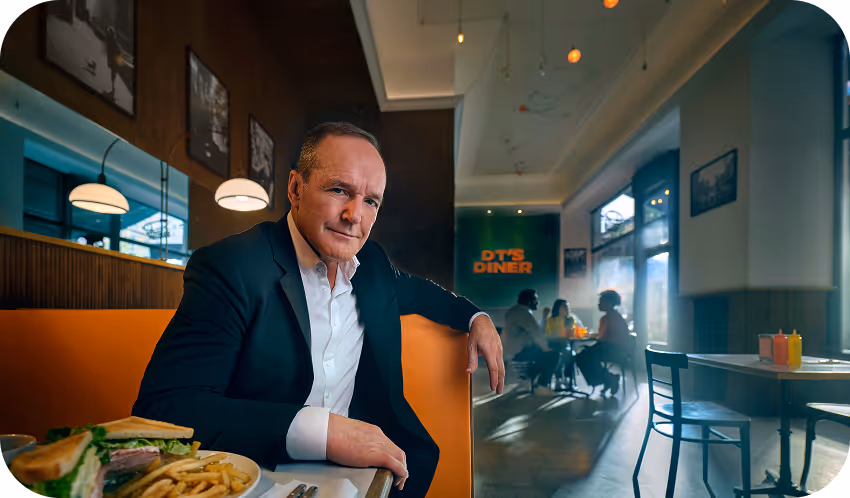
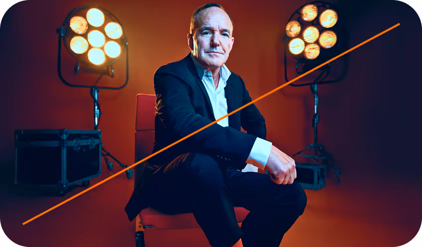
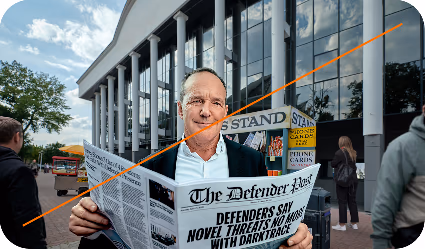
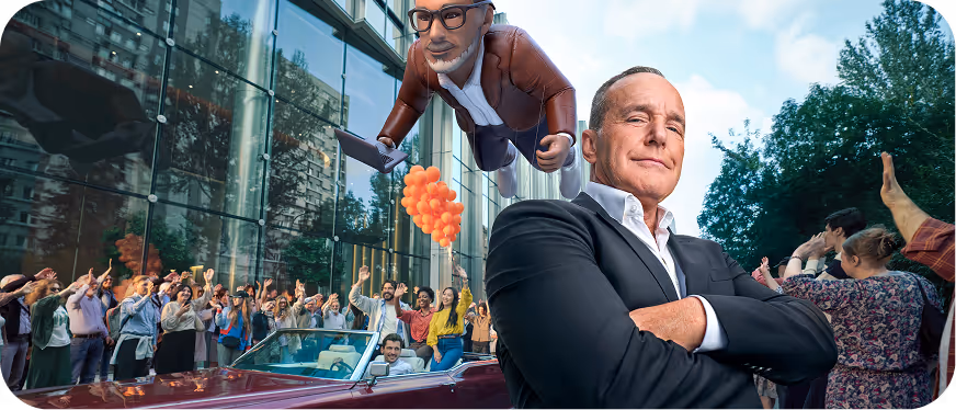
Restricted use of celebrity
Clark Gregg's likeness, image and campaign structure are not to be reproduced, distributed or reinterpreted without the explicit direction and guidance from the VP of Brand, Jeff Rennacker via brand@darktrace.com
Thank you for your consideration, we are under legal obligation to maintain our contractual agreements.
Look and Feel
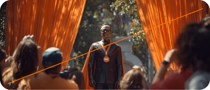
Bold and engaging Composition prioritizes medium closeups and shallow depth-of-field to focus on the subject’s expression and connection. The still photography and short-form digital pieces inherit their look and feel from the original films, in which we must maintain for continuity across all mediums.


Photography Treatment
Cropping Subjects Outside the Image Border
Place image in the image container as demonstrated in the Grid and Layout section.
Make a copy of your image inside the container and mask the subject to remove the background, then place the subject’s mask beyond the image container.
To make sure your subject has been placed correctly it has to be visible beyond the image container and maintain legibility with other elements within the asset composition.